
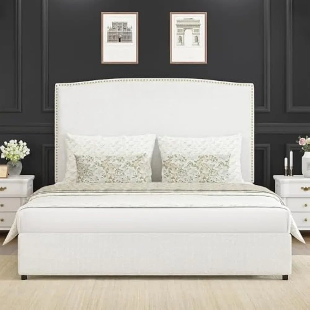

Full Size Upholstered Platform Bed Frame with 56" Headboard Soft Boucle Fabric Mid-Century Modern Design Full Bed Frame
SPECIFICATIONS
Appearance: Classic Style,Modern Style,Traditional,Scandinavia,Modern Morocco
Bed Surface Fabric: Fabric
General Use: Home Furniture
High-concerned chemical: None
Installation Method: Assembly
Material: Metal
Maximum Weight Recommendation: 800 Pounds
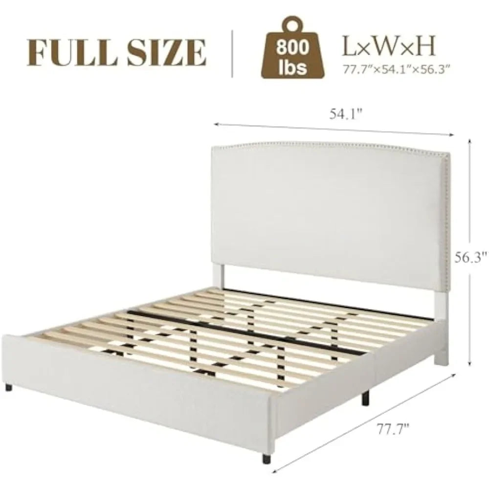
Product Dimensions: 77.7"L x 54.1"W x 56.3"H
Specific Use: Home Bed
Style: Minimalist Modern,Modern
Type: Bedroom Furniture
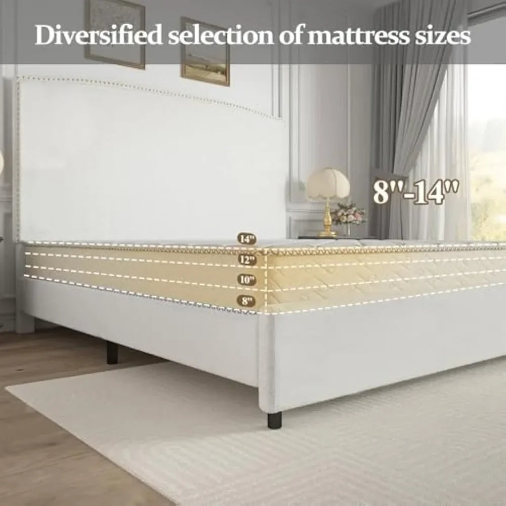
Width(Mattress Size): 1000mm,1200mm,1500mm,1600mm,1900mm
With Storage Space: Yes
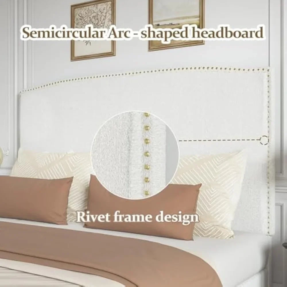
Mid-Century Modern Elegance: This full platform bed frames features a smooth, full-back headboard and nail head decoration, which can enhance the aesthetics of your bedroom. The understated legs offer stable support while complementing contemporary or retro decorative styles
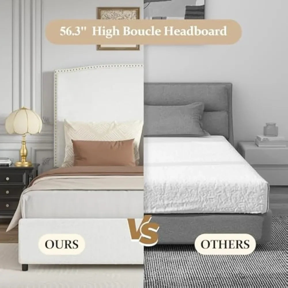
Plush Back Support: This is a upholstered bed frame with a 56.3-inch soft-padded headboard, made of soft fiber fabric, providing luxurious comfort for reading or movie nights. The perfect height eliminates cold wall contact
Pet-Friendly High-quality Fabrics: This full bed frame is made of stain-resistant circular textiles, making it effortless to wipe clean. The tightly woven structure resites scratches from claws, making it an ideal choice for families with children and pets
Sturdy & Quiet Construction: The heavy-duty metal frame and reinforced wooden strips support 800 pounds. The foam filling of the tall bed frame with noise reduction can prevent squeaking and is very suitable for light sleepers
Easy Assembly: This full size beds includes pre-connected hardware and numbered components. All the accessories are in one box. Two people can complete it in about half an hour by following the steps in the manual


width: 100%;
height: 100%;
background-repeat: no-repeat;
background-size: cover;
}.aplus-v2 .apm-brand-story-carousel-container {
position: relative;
}
.aplus-v2 .apm-brand-story-carousel-hero-container,
.aplus-v2 .apm-brand-story-carousel-hero-container > div {
position: absolute;
width: 100%;
}/*
Ensuring the carousel takes only the space it needs.
The sizes need to be set again on the absolutely positioned elements so they can take up space.
*/
.aplus-v2 .apm-brand-story-carousel-container,
.aplus-v2 .apm-brand-story-carousel-hero-container {
height: 625px;
width: 100%;
max-width: 1464px;
margin-left: auto;
margin-right: auto;
overflow: hidden;
}
.aplus-v2 .apm-brand-story-carousel-hero-container,
.aplus-v2 .apm-brand-story-carousel-hero-container > div {
height: 625px;
}.aplus-v2 .apm-brand-story-carousel.a-carousel-container {
padding: 0px;
}
/*
This centers the carousel vertically on top of the hero image container and after the logo area (125px).
Margin-top = (heroHeight - cardHeight - logoAreaHeight) / 2 + logoAreaHeight
*/
.aplus-v2 .apm-brand-story-carousel .a-carousel-row-inner {
margin-top: 149px;
}
/*
Cards need to have a width set, otherwise they default to 50px or so.
All cards must have the same width. The carousel will resize itself so all cards take the width of the largest card.
The left margin is for leaving a space between each card.
*/
.aplus-v2 .apm-brand-story-carousel .a-carousel-card {
width: 362px;
margin-left: 30px !important;
}
/* styling the navigation buttons so they are taller, flush with the sides, and have a clean white background */
.aplus-v2 .apm-brand-story-carousel .a-carousel-col.a-carousel-left,
.aplus-v2 .apm-brand-story-carousel .a-carousel-col.a-carousel-right {
padding: 0px;
}
.aplus-v2 .apm-brand-story-carousel .a-carousel-col.a-carousel-left .a-button-image,
.aplus-v2 .apm-brand-story-carousel .a-carousel-col.a-carousel-right .a-button-image {
border: none;
margin: 0px;
}
.aplus-v2 .apm-brand-story-carousel .a-carousel-col.a-carousel-left .a-button-image .a-button-inner,
.aplus-v2 .apm-brand-story-carousel .a-carousel-col.a-carousel-right .a-button-image .a-button-inner {
background: #fff;
padding: 20px 6px;
}
.aplus-v2 .apm-brand-story-carousel .a-carousel-col.a-carousel-left .a-button-image .a-button-inner {
border-radius: 0px 4px 4px 0px;
}
.aplus-v2 .apm-brand-story-carousel .a-carousel-col.a-carousel-right .a-button-image .a-button-inner {
border-radius: 4px 0px 0px 4px;
}.aplus-v2 .container-with-background-image {
width: 100%;
height: 100%;
background-repeat: no-repeat;
background-size: cover;
}


